Author Archive

Hello 2019! Colors, Trends and Design

Happy New Year 2019

Individuality is being much more celebrated in home design.  This is a wonderful way to express yourself with having one of kind, stand out pieces created by different artists whether it is furniture or artwork.  Classic and Modern have joined together to create a beautiful blend that can work with many home settings and update a room.

credenza

Ethereal materials, mixed metals, starburst shapes, iridescent surfaces and blues and violets will be prevalent this coming year.  Along with this we will be seeing products made from natural materials, earthy motifs and organic shapes as we all need to connect with nature more.  As nature becomes a large part of design each year I think due to our urbanization, we are seeing a direct impact on furniture design mixing bamboo and rattan with high sheen lacquers.  Bold patterns and tartans are also being seen for home interiors. 

unique coffee table

Design is about creating a personal narrative!  It is so much more than just function and beauty.  When traveling look for unique pieces to add that touch of sophistication and create memories for you and your family.

Exciting Trends and Intriguing Designs

Now that we are all back in our routines, we start to think of the upcoming holidays and are looking for tips to freshen things up or do a complete re-do.  I have put together a few new items that are trending and new this season.

Metals are big!  Bright shining brass to rose gold and everything in between is in!  I hear you …what?  Just got rid of all the shining brass…well here are just a few examples in lighting fixtures by Curry and Co. in brass.  I encourage clients to mix metals up makes the room more interesting when everything isn’t all the same.

This new fabulous look is from York Wallcoverings.  Talk about transforming a room.  I see this wallcovering in a dining room although it would look amazing anywhere.  The paper is made of pure Mother-of-Pearl woven into a cotton-linen backing with no pattern repeat.  Get ready to transform any space into a gorgeous jewel box with light reflecting off the walls. Yummy!

Rennovating your home? Here are some pointers.

rennovation

It has been a busy spring so far with many clients doing renovations rather than moving and changing their location.   Once a decision has been made to renovate you all have to be in agreement to keep an open mind, communicate and be prepared for issues but know it will all work out. Know that your home will be turned upside down for a month or two depending on what you are doing.  A common question I am asked is “What will stand the test of time and not become dated quickly?”.  I believe the key to long-term success in interior renovations is to truly do what YOU love.  When choosing cabinetry, countertops and flooring pick the textures and surfaces that are your style instead of settling on trends.  These are the most expensive items in a renovation so you really need to love what you choose.  When redoing a kitchen large kitchen islands are very much trending right now and becoming the focal point of the room.  The choices are endless so having a professional to work with can help with the overwhelming decisions that have to be made daily.

Painted cabinetry in lieu of stained cabinets is topping the list, cleaner lines and yes satin brass faucets and satin brass cabinet hardware are back!  Blue continues to be the cabinet color of choice in the kitchen and now spreading to other areas of the home.

Color is dominating the design space from shocking pink, blush, lavender, blues and greens.  Lacquered walls in a den or library can create a jewel like effect on a room which I love.  Using bright colors as accents or main pieces adds fun and joy and makes a room feel more energetic.  If you are looking for a serene space like a bath or bedroom soft muted hues are the choice.  Color can be added to the floor and accessories.

We often refer to the ceiling as the 5th wall when deciding on paint colors but really there is a 6th—the floor.  Hand painted floors can add visual harmony and whimsy. 

Lighting is paramount and makes a huge impact on a room.  I can’t stress enough how important light and color work together in a room.

SWEET SCENT OF SPRING!

Spring has definitely come earlier than normal this year for the Dallas area.  Who doesn’t love seeing the fresh green buds of leaves on the trees, all the tulips and daffodils in all their glory, wisteria and flowering trees all blooming.  It only is for a few weeks that we can enjoy these special florals letting us know that winter is behind us.

To celebrate spring why not plan an outdoor luncheon or brunch or afternoon tea with friends with a grand bouquet of white viburnum and branches of boxwood or Bradford pear branches?  Setting your table with colors of spring with pinks, lavender, mint green and yellows with coordinating monogrammed napkins makes a gorgeous table.  Go to http://www.halohomebyksw.com/ to see beautiful linens and monogramming.   I would tuck some grape hyacinths tied with a small ribbon in the napkin as well.  Entertaining outdoors sets a carefree tone that cannot be duplicated at an indoor party.  Who can compete with Mother Nature? 

Outdoor table setting number 1

It is no greater surprise than to use your fine china and glasses outdoors.  This setting practically guarantees a good time.  Keep your menu simple.  Serve mint juleps or Pimm’s for drinks.  Remember most of the attention will be directed toward the decorations and surroundings outside.

Outdoor table setting from Veranda

A thirst-quenching, supremely summery drink (in England, it’s a must at cricket matches), Pimm’s Cup, mixes lemony soda (or ginger ale), fruit, cucumbers, mint, and a fortifying shot of gin. Pimm’s No. 1, a gin-based drink, was invented in 1823 by James Pimm, who served it at his oyster bar in London. It is widely available at liquor stores.

Pimms cocktail

How to Make It

  1. Take a jug (if you want to make several glasses) or a glass and add as much ice as you like.
  2. Pour one part Pimm’s No. 1 with three of fizzy lemonade over the ice.
  3. Add mint leaves, thin cucumber slices, orange slices and strawberry (all or some depending on what you prefer) and serve.


How to Put Instant Patina on Your Walls

patina on your walls

Looking for ways to give your drywall the feel of century old plaster?  Look no more. Those of you familiar with the great designer, art collector and antique dealer Axel Vervoordt will be thrilled to hear that you can get that look now in the USA.  Belgian artisan Eddy Danker, who is the maestro behind designer Vervoordt ethereal finishes for drywall has brought the finishes to the New World for the Old World look.   They are ready-mixed, mineral-based pigments that will give your walls the look of old with just a few coats.

The paints come in more than 140 shades!

Vervoordt’s style is his commitment to making the past a relevant part of today’s design.  If you are looking to add more elegance to your home and make it more personal you can start transforming your space by making your walls more interesting by evoking walls to look like plaster and lime wash.


Go to Dominque Finishes to learn more and see the shades that are available.


Trends to add Autumnal Warmth and Update your Space

Interior design is like fashion design as it is an ever- changing marketplace.  Although the worlds of interior design and furniture don’t move at the same speed as fashion since swapping a sofa isn’t like changing your trousers the trends still are out there. With the change of seasons new colors arrive and what was old and vintage is new again but reinvented in a different way. 

4-chairs-outdoors

There is no competing with the perfection of Mother Nature with the colors, woods, textures, iridescence of precious stones and crystals that are everywhere in interior design today.  Crystals and natural stones are being used to adorn lamps, chandeliers, napkin rings and also independently as an accessory on their own on a table or shelf.

wooden-stick-coffee-tablecut-tree-trunk-coffee-table

Textures of grass cloth, linen, shagreen, vellum, woven natural fibers, parchment and burled wood are being used to bring the organic, Zen feel to our homes which is the escapism we seek.

metal-end-tablecrystal-box


Hot colors to accessories with your natural environment are turquoise, jade, citron and persimmon.  All these colors will make your room come alive with interest and personality!

wood-chair-cloth-seat


Frances Valentine—aka Kate Spade

Kate Spade started her handbag company Kate Spade New York in the ‘90s but she is no longer affiliated with this company that bears her name.  So after a fulfilling stint as a stay at home Mom she has started a new venture and changed her name to Frances Valentine.  It is an accessory line that she and her designers design mainly shoes and handbags based on things she looks for when she actually goes out to shop.

Frances Valentine Collection


Sparkle Anyone?

Glitter Grout comes in 10 colorsGlitter grout will compliment any wall or floor tile, mosaic or feature tiles and is available In 10 colors. All are totally flexible and with hygienic anti mold properties and are suitable for areas, subject to water.
Sparkle grout is ready mixed glitter grout that is ready to go.   The glitter grout range offers guarantees against color fade, frost, mold and lime scale.

There are also sparkle glitter paints that can be applied over any base color to produce amazing eye-catching effects and dries totally clear, this glitter paint turns any wall or ceiling into a sparkly star effect that will dazzle every time a light is reflected that will be the talking point of any room.

A new decorative way to add a little sparkle to guest bath, child’s bedroom or dining room ceiling!  Ideas are endless.

METALLICS…DYNAMIC AND ALL THE RAGE RIGHT NOW!

Blog aug18.16For the past 10 years a neutral color palette was all that clients seemed to want specifically the grays.  So that a room doesn’t feel lifeless and boring with using only neutrals you need to create some strong textures and punches of color to make these rooms work.  In this blog I will specifically discuss the use of metallics.  This is a great way to Introduce some shimmer and shine and a dose of glamour by mixing several metals.  Choose a subtle approach when doing this by pairing some chrome drawer pulls with an antique bronze mirrored table for example.  Mixing metals doesn’t have to be a bold choice!  With metallic all the rage right now, gold and silver alike are topping the décor charts.  Bringing the two together makes the room look more interesting and intriguing but also gives the room a sense of visual dimension and texture.  Striking the right balance can feel reflective, eclectic and elegant.

For example you can use window coverings in a golden hue and hang a silver ceiling fixture and you will see how they complement each other.  Accent tables are another place to feature your mix use of metals.  By bringing in different types of metal finishes into a space you are adding a more glamorous and sophisticated look to your room.

So don’t resist or think that it is a faux pas this is a great way to bring richness to your space.

Transitional, …What does this Design Term Mean?

Picture3We hear this term “transitional” being used to denote a certain style in the last 10 years.  But what does it really mean?  This is a great way to update the look of a room by incorporating new furniture and décor styles with your existing furniture if you aren’t re-doing the whole room.  This works because Transitional really means combining a mix of modern and traditional styles.  This can be challenging to create a cohesive transitional room if you don’t know exactly what this term means.

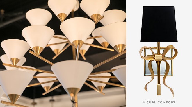
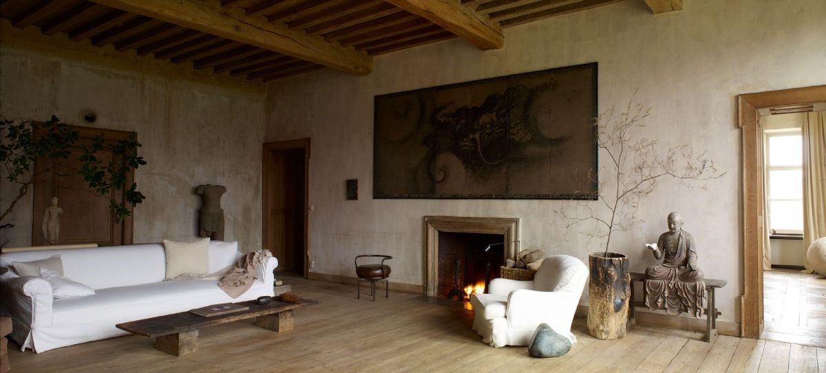
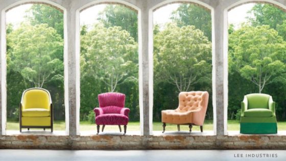
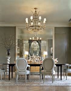
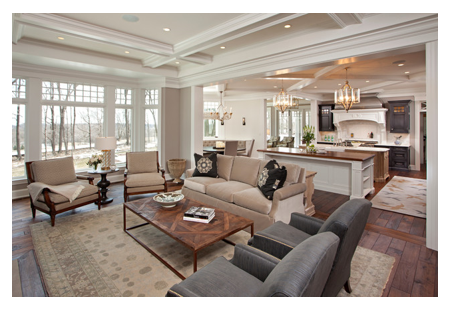
Simply said Transitional is it not too cold, not too fussy and not too formal.  It won’t necessarily suit color enthusiasts because it is about warm neutrals which would include cream, taupe, tan, grays, khaki and the occasional hit of espresso brown or chocolate.  Wood tones from warm brown to chocolate are typically the only deep tones used.    There is no room in this look for punchy florals or Pucci-esque prints.  To get a jolt of color keep it to a few strategic accents, for example in lamps, artwork and throw cushions.Picture2

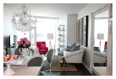
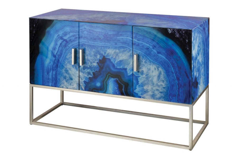
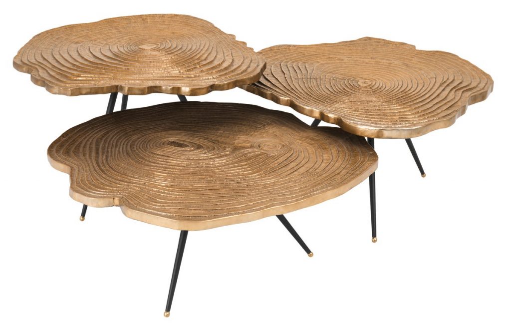
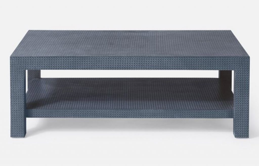
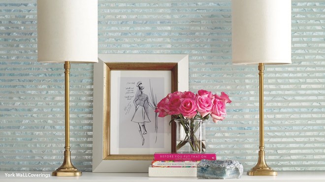
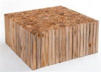
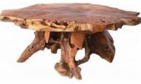
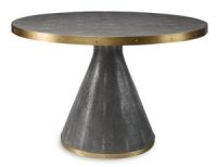
The living area will read as monochromatic but it is anything but boring due to the fact that Transitional is all about textures. Woven fabrics, natural fibers, blend of matte and shiny finishes which lend a sense of layering.   The metal of choice has been brushed nickel or silver used in frames with simple lines, fixtures and accessories.  I was recently at the Dallas Market and was seeing gold as well on many pieces from coffee tables, fabric, accessories and mirrors.  Mixing metals makes the room more interesting to the eye and once again it is about blending looks.

Flooring is kept neutral with the use of soft colored carpets or wood floors in warm tones.  Texture in the carpets or rugs is important.  Window treatments are basic panels of a solid color or subtle design and shirred on simple rods. Choose clean Roman shades in fabric or in a woven wood when using blinds.  Treat windows elegantly but simply.  No billowing draperies or elaborate finials in transitional design are used they overpower and feel overdressed in this design style.Picture1

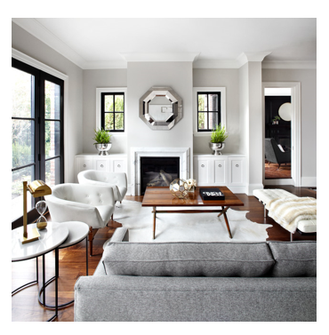
When choosing accessories do so wisely and limit the pieces to ones that are impactful.  Minimal accents are used in a style that has no room for frills and clutter.

The secret to a Transitional space should peaceful, restful and to make one feel at ease.  After all isn’t that what we want in our home?  It’s no wonder this design style has become as popular as it enables you to create your own stamp and bring your personality softly into your home.